FreshStart
A responsive web and mobile platform that helps immigrants navigate job search in a system that wasn't built for them.
Tools:
Figma,
Google Suite
Role:
Research,
Design

Problem
Immigrants face visa ambiguity, language barriers, and unfamiliar systems in the job market.
Over 2 million skilled immigrants in the US are underemployed or unemployed. Their biggest obstacle isn't their skills, but the ambiguity of everything else. This results in wasted time, repeated rejection, and a hit in confidence.
FreshStart was designed to remove that uncertainty before it becomes rejection.
Research & Discovery
I interviewed 5 potential users and created a persona.
Some common themes of uncertainty are not knowing which jobs they could apply for, unexplained rejections, and only discovering a company didn't hire international candidates at the final stage of the application.

I then audited 3 existing immigrant job platforms to find gaps between what exists and what Tommy needs.
All 3 platforms offer coaching and resources, but none of them have a job board. Instead, they redirects users to a physical location, leaving the hardest part of the process unaddressed.

Findings
There is uncertainty at every stage, especially the last stage.
Uncertainty doesn't just slow the job search down, it makes every step feel like a risk.
Time is wasted on applications that do not accept visas.
The formal language in job postings is difficult to navigate.
Existing platforms offer coaching, but not a job board.
Ideation
I started with sketching pages focused on a job board and career resources, then created digital wireframes.
Because there is a lot of confusion and isolation for applicants, I focused FreshStart to create a simple application process and a community board.


Usability Testing & Iterations
I ran an unmoderated usability test on 5 participants.

A series of tasks uncovered these key results:
Personalization
Finding: Users liked the personalization of having their visa status tied to their account. This decreases the user's anxiety during their application process.
Solution: Every job will list the types of visa they accept. The jobs will then be filtered according to the applicant's eligibility.

Ease of application
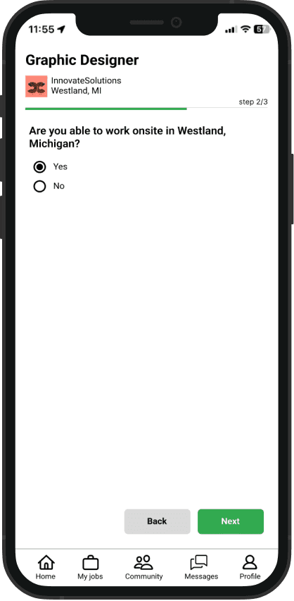
Finding: Users liked that the application process was very straightforward and efficient.
Solution: FreshStart will extract editable information from the applicant's resume into their profile to ease the application process.



Privacy
Finding: Users had privacy concerns about including their country in their profile.
Solution: The country field is removed, leaving only the visa status to protect their privacy.

Before

After
Final Designs
Two views, one consistent experience
FreshStart lives across two surfaces because the moments when immigrants search for jobs don't always happen at a desk.
Interact with my mobile view prototypes and desktop web prototype.
Apply to an eligible job, connect with other immigrants through the community board, and follow up through messages.
On desktop, the application flow stays as an overlay so users never lose their place.
Reflection
Small decisions, big impact
Removing a single field, adding a qualifying checkmark, letting someone browse before signing up. I learned that these small design decisions makes the difference between confidence and wasted effort for someone navigating an unfamiliar system.
Next Steps
If I continued this project, I'd want to test with recent immigrants to pressure-test some assumptions I made about language, literacy, and trust. I'd also explore how FreshStart could partner with coaching organizations rather than replace them.