HomEase
A mobile-focused website that helps roommates manage shared household responsibilities without awkward conversations. Task tracking, expense splitting, and group communication. All in one place.
Tools:
Figma,
Figjam,
Otter AI
Role:
Design,
Research
(team of 4)

Problem
Roommates don't fight about chores, they fight about fairness.
The frustration in having roommates is not the dirty dishes, it is the assumption that nobody cares and the discomfort of having to say something about it.
How might we help roommates create shared accountability for household tasks without making it confrontational?
Research & Discovery
We interviewed 8 roommates and learned that the friction was about ambiguity.
People didn't know what was expected of them, couldn't see what their roommates were responsible for, and felt too uncomfortable to bring it up directly.
Existing tools made it worse: roommates were already juggling Splitwise for expenses, iMessage for communication, and iPhone Notes for task lists. Nothing talked to each other, and no one had the full picture.

Findings
One thread connected every interview: no one wanted conflict, but no one had a way to avoid it.
When task ownership is unclear, people assume others are doing less, even when they aren't.
Asking a roommate to do their chores creates social friction that most people would rather avoid.
Switching between tools to manage one shared space is its own source of frustration.
Ideation
My focus was the Task Tracker and Home page, the feature most directly tied to the core tension.
The challenge was to design accountability that felt fair and visible without feeling surveillance-like.
I explored how to show task status in a way that motivated action through empathy rather than guilt.

Sitemap
We started as a mobile app before pivoting to a responsive website mid-project, which meant rethinking our navigation and information architecture entirely. The final structure has a single home anchor with clearly defined branches.

Design System
Aligning the team with a shared design system
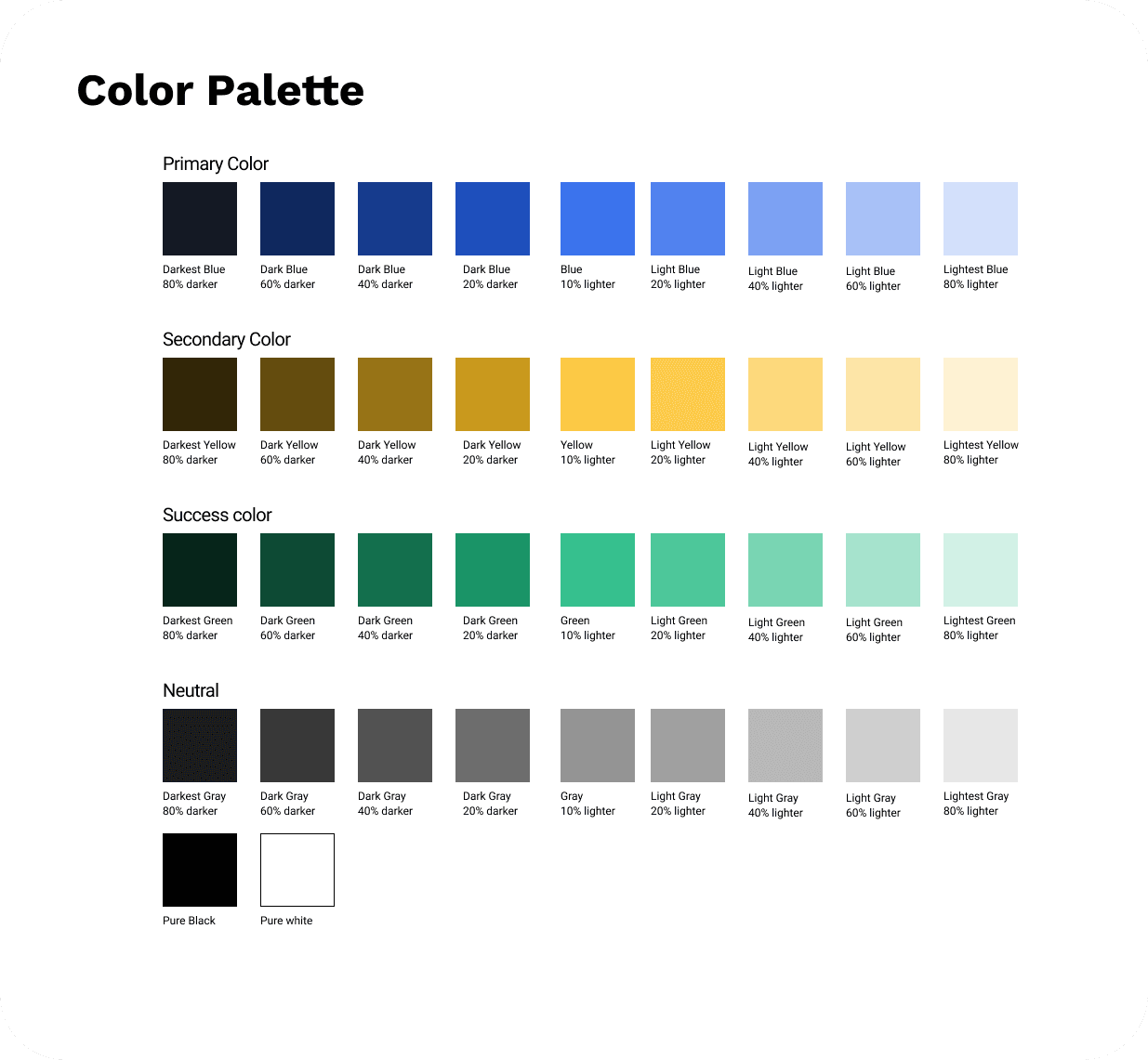
We built a shared design system covering typography, color, paddings, components, and icons. This helped the team have a common foundation as we branched out to our ideas.


Usability Testing & Iterations
We then ran moderated usability tests with our low-fi prototypes, giving our participants a list of tasks to complete.
Payment reminders does not feel personal while chore reminders do
Finding: Users were uncomfortable with a reminder button on the task tracker but wanted one for expenses. To them, a payment reminder feels appropriately transactional while a chore reminder feels like a callout.
Solution: Removed the manual remind button from task tracker entirely while keeping it on the expense page.

Certain wordings created friction
Finding: Words like "lent", "borrowed", and "settle up" caused hesitation.
Solution: Simplified all terminology, moved the Balance Summary to the top, and used color and icons to improve scannability.

Before

After
Checkboxes undermined shared visibility
Finding: The original task view only showed each user their own tasks, which reinforced the exact problem we were trying to solve. No one could see the full picture.
Solution: Redesigned the task tracker to show all roommates' responsibilities together, making accountability visible to everyone.

Before

After
Final Designs
Reflection
Good design is emotional, not just functional
This project reinforced my understanding that design focuses on human behavior rather than just human tasks. Roommates didn't just want a clean apartment, they want to feel like things are fair without needing to fight for it. Designing for that emotional layer, not just the task layer, is where the real work is.
Next Steps
I'd want to test with roommates over a longer period to see whether the avatar system actually changes behavior over time, or whether the novelty wears off. I'd also explore how the app handles situations where one roommate isn't engaging at all.